


Inspiring Baby Room Color Schemes for a Dream Nursery
Choosing the right baby room color schemes is one of the very first, and most exciting, steps in creating a space that feels personal and nurturing for your little one. It’s about so much more than just the classic pinks and blues. The colors you choose will set the entire mood for a room that feels calming, supports your baby’s development, and shows off your family’s unique style.
Crafting The Perfect Nursery Atmosphere With Color
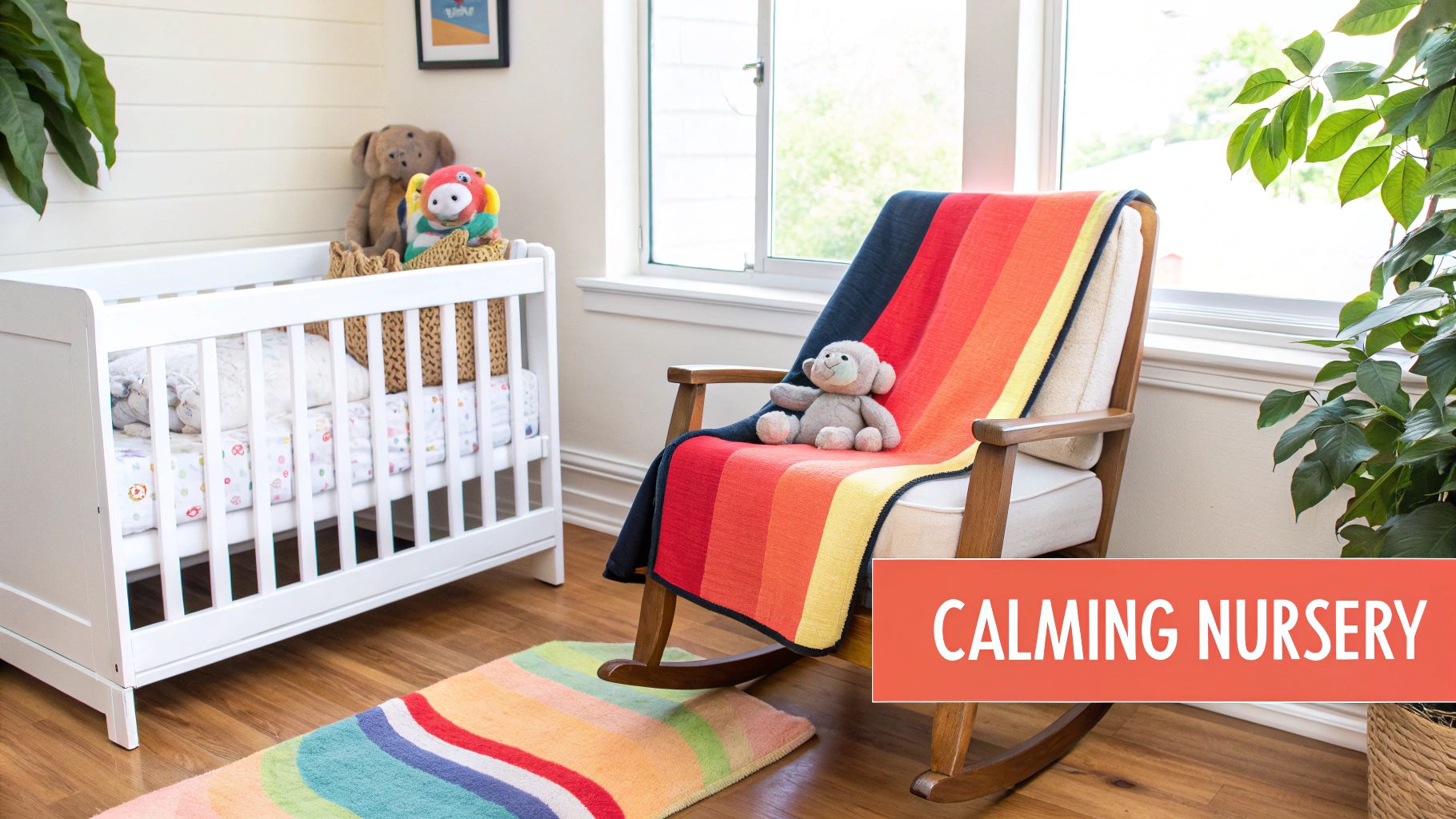
Designing a nursery is easily one of the most joyful parts of getting ready for a new baby. The colors you pick are more than just decoration; they’re the backdrop for countless memories you’ll make, from quiet midnight feedings to playful afternoons on the floor. The right palette can create a serene environment that encourages rest while offering gentle stimulation.
Think of the room’s color as its primary language. It communicates a feeling before anything else does. A soft, earthy green might whisper tranquility, while a cheerful, muted yellow can add a touch of sunny optimism without feeling too loud or overwhelming.
Building Your Personal Palette
The secret to a nursery design you’ll love is creating a palette that feels authentic to you. Instead of getting boxed in by trends, just start with a single color you genuinely love—one that makes you feel happy or at peace. From there, you can build a beautiful, harmonious scheme.
Try these first steps to guide your choices:
- Find a Core Color: What hue makes you feel calm and happy? This will be the anchor for your entire design.
- Layer in Complementary Tones: Pick a few lighter and darker shades of your core color to create depth and keep things interesting.
- Mix Warm and Cool Hues: A well-balanced room often mixes calming cool tones (like blues and greens) with inviting warm tones (like soft terracottas or natural wood finishes).
A well-balanced, inviting room will have a combination of both warm and cool tones, though not necessarily in equal measure. In general, cool tones are more calming, and warm tones are more exciting, allowing you to tailor the room's energy.
Beyond The Paint Color
Once you have a palette in mind, remember that the walls are just the beginning. To create a truly serene and secure space, many parents look for the best window treatments for a nursery to balance light, privacy, and safety. These functional pieces play a huge role in the room’s overall atmosphere and its color story.
This is also where personal touches can transform a pretty room into a meaningful haven. A Custom Photo Blanket, for example, can bring cherished family moments into the space and tie the whole design together. Just imagine a soft, personalized blanket draped over the rocking chair, adding a layer of warmth and love that makes the space uniquely yours.
For a deeper dive into bringing all these elements together, you can find out more about how to decorate a nursery in our detailed guide.
Understanding the Psychology of Nursery Colors
Colors do more than just make a room look pretty—they have a real impact on our mood, emotions, and even behavior. When it comes to a nursery, picking the right hues can mean the difference between a restless space and a tranquil one that encourages sweet dreams and gentle development. This is where the magic of color psychology comes in; every shade you choose helps shape the atmosphere your baby experiences every single day.
Think about the instant calm of a soft, muted green, like a quiet meadow. Or picture the secure, comforting feeling you get from warm, earthy neutrals that feel like a cozy hug. Once you understand the "why" behind your color choices, you can design a space that doesn't just look beautiful but actively nurtures your baby’s well-being. It’s about creating a nursery that’s both a visual treat and an emotional sanctuary.
The Power of Calm and Soothing Hues
Some colors just have a knack for chilling us out. These are the shades that help lower energy levels, reduce stimulation, and create a serene backdrop perfect for lulling a baby to sleep. They work their magic because their shorter wavelengths are less stimulating to our eyes.
This is a huge win for a baby's room. Both psychological studies and sales data show that soft blues and greens in baby room color schemes can help reduce infant crying by up to 15% and improve sleep quality by 20%. It’s no wonder that refreshing blue-green tones have seen a surge in popularity, with 28% of new parents grabbing similar shades for their soothing vibes. You can dive deeper into these fascinating baby room color findings to learn more.
Here’s a quick look at the most popular calming colors:
- Soft Blues: Think clear skies and calm seas. Blues are known to lower blood pressure and create a feeling of peace and tranquility. They’re a classic for a reason—they genuinely help foster a restful vibe.
- Gentle Greens: Evoking nature, shades like sage, mint, and olive green bring a sense of balance, harmony, and restoration. Green is one of the most restful colors for the eye, making it an absolute superstar for a nursery.
- Muted Purples: Light lavenders and lilacs might be a surprise, but they can be incredibly serene. These shades mix the calming stability of blue with a gentle touch of energy, creating a space that feels both peaceful and creative.
Using Warm Tones Thoughtfully
While cool tones are fantastic for encouraging rest, warm colors have their own special job in a nursery. Shades like soft yellows, muted peaches, and warm beiges can make a room feel cozy, welcoming, and cheerful. The trick is to use them strategically so they don’t become overstimulating.
Think of warm colors as the nurturing hug of the color world. They are perfect for creating a space that feels loving and secure.
Expert Tip: Instead of drenching the entire room in a bright, warm color, use it as a thoughtful accent. A single feature wall, a warm-toned rug, or textiles like a Custom Photo Blanket can introduce that cozy warmth without disrupting the room's peaceful atmosphere.
The Impact of Neutral Palettes
It's easy to see why neutral colors like beige, taupe, and soft gray are so popular for nurseries—they offer a versatile and timeless foundation. They create a clean, uncluttered look that feels both sophisticated and calming. Far from being boring, a neutral palette lets textures and personal touches be the star of the show.
Here are a few reasons to love a neutral scheme:
- Longevity: A neutral nursery grows with your child, easily transitioning into a toddler's room and beyond. That means less redecorating for you!
- Versatility: It’s so easy to add pops of color with accessories, bedding, and decor. You can swap them out as your child's personality starts to shine through.
- Serenity: Neutral tones are naturally calming and won't overstimulate a baby's developing senses, making them a fantastic choice for a peaceful sleep space.
By carefully picking and balancing these color families, you can craft a nursery that’s perfectly tuned to your baby’s needs—a beautiful space designed to soothe, comfort, and inspire right from the very beginning.
Timeless and Trending Nursery Palettes to Inspire You
Now that we’ve covered the feelings colors can bring into a room, it’s time for the really fun part: exploring beautiful, ready-to-go baby room color schemes. This is where we move from theory to practice, with curated palettes that range from timeless and calm to modern and full of personality. Each one sets a distinct mood and gives you a solid foundation to build on.
Think of these palettes as a creative launchpad. They’re designed to feel fresh but have real staying power, adapting easily as your sleepy newborn grows into a curious toddler. This is where you’ll see how a great color scheme becomes the perfect canvas for all the little decor pieces that will make the room truly yours.
Earthy Serenity A Grounded and Nurturing Space
One of the most loved palettes for modern nurseries is deeply rooted in earthy tones. This scheme pulls colors straight from nature to create a space that feels calm, warm, and incredibly nurturing. It’s like bringing the quiet peace of a forest or a sun-drenched field right into your home.
The Earthy Serenity palette is perfect for a gender-neutral space that feels both sophisticated and cozy.
- Core Colors: Sage Green, Terracotta, and Cream.
- Mood: Evokes a sense of calm, stability, and connection to the natural world.
- Implementation Tip: Use sage green on the walls as your main color, then bring in terracotta through textiles like a rug or a few throw pillows. Cream for the furniture and trim will keep the whole space feeling light and airy.
The visual below shows just how much colors can influence a baby's world, from promoting calmness and better sleep to lifting their general mood.
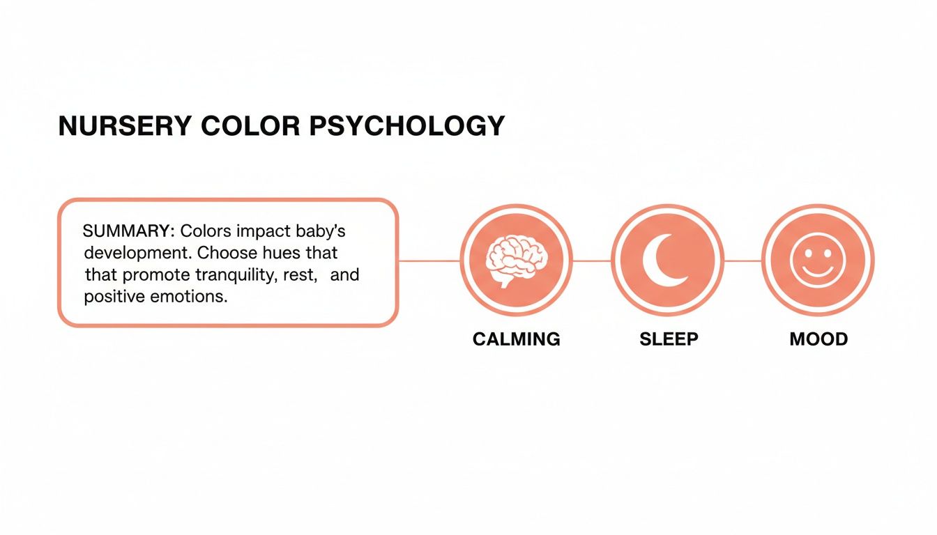
This just goes to show that a thoughtful color palette does more than just decorate—it helps create a supportive atmosphere for your little one to grow.
Coastal Calm A Breath of Fresh Air
If you’re dreaming of a nursery that feels light, airy, and totally tranquil, a coastal-inspired palette is a fantastic choice. This scheme channels the relaxing vibe of a seaside escape, using soft colors that remind you of sand, sea, and sky. It’s a timeless look that always feels like a breath of fresh air.
This palette works especially well in rooms that get a lot of natural light, as it really enhances that bright, open feeling.
A coastal theme is less about putting seashells everywhere and more about capturing a feeling of peace and openness. It’s a classic for a reason—it creates an incredibly restful environment for both baby and parents.
To bring this look to life, focus on these elements:
- Core Colors: Soft Blue, Sandy White, and Driftwood Gray.
- Mood: Creates a serene, breezy, and uncluttered atmosphere.
- Implementation Tip: Paint the walls in a soft, muted blue. Choose sandy whites for the crib and dresser, and use driftwood gray for accents like a rocking chair or picture frames to add a gentle, rustic contrast.
Modern Monochrome with a Playful Twist
A monochrome palette is a bold, modern choice that can be surprisingly playful and stimulating for a nursery. High-contrast patterns are known to grab a newborn's attention, making this a visually engaging option for their developing eyesight. The trick is to soften the crisp black and white with warm textures and a single, happy pop of color.
Recent trends are definitely shifting. While neutral palettes hit 75% popularity in the 2010s, we're now seeing a huge reversal. 58% of new nursery designs are leaning into 'color as the theme,' signaling a big move toward more expressive and vibrant spaces.
Here’s how to create a monochrome room that feels chic yet totally kid-friendly:
- Core Colors: Black, White, and a vibrant accent like Mustard Yellow or Teal.
- Mood: Stylish, stimulating, and modern.
- Implementation Tip: Use white as your base to keep the room feeling bright and open. Introduce black through patterns—think a striped rug, fun wall decals, or printed textiles. Finally, sprinkle in your accent color in small doses. A lamp, a piece of art, or a Custom Photo Blanket featuring the hue can be the perfect finishing touch.
Of course, choosing the right theme is just as important as the color palette. For more ideas on how to pair these schemes with a cohesive look, check out our guide on delightful nursery room theme ideas to find the perfect match.
Layering Color with Textiles and Decor
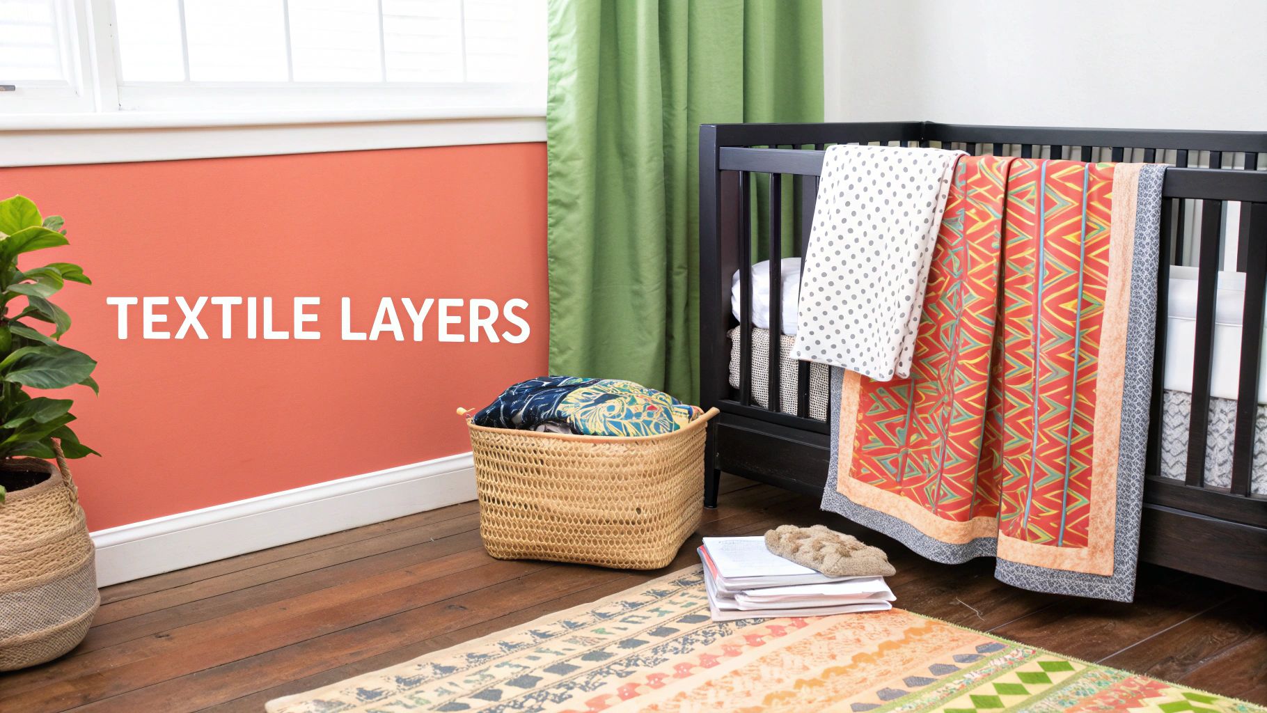
A truly inviting nursery is built in layers, and your wall color is just the beginning of the story. Think of the paint as your canvas. Now, it’s time to add depth, warmth, and personality with textiles and decor. These are the elements that transform a room from just a painted space into a cozy, multi-dimensional sanctuary for you and your baby.
Each piece you add—from the rug underfoot to the curtains framing the window—weaves into the overall color story. This is how designers create rooms that feel rich and complete. It isn't just about matching colors; it’s about pulling together different textures, patterns, and shades to build a comforting and cohesive atmosphere.
The Foundational Layer: The Nursery Rug
After the walls, the rug is often the second-largest block of color in the room. This makes it a critical piece for anchoring your chosen baby room color schemes. It’s the perfect opportunity to introduce a secondary color from your palette or add a playful pattern that brings the entire space to life.
Here are a few ways to think about it:
- For a Bold Room: If your walls are a strong, saturated color, a neutral or subtly patterned rug can provide a calming balance. It keeps the space from feeling overwhelming.
- For a Neutral Room: This is your chance to be adventurous! A rug with a bold geometric pattern or a rich, deep hue can inject energy and personality into an otherwise soft space.
- Texture is Key: A high-pile or shag rug adds physical warmth and a soft spot for playtime, while a flat-weave rug can introduce intricate patterns without adding too much visual weight.
Framing the View with Curtains and Drapes
Curtains do more than just block out light. They're vertical planes of color and texture that draw the eye upward, making the room feel taller and more finished. They offer another chance to layer in a complementary color or a subtle pattern. A set of soft linen curtains in a hue slightly lighter or darker than the walls can create a sophisticated, tonal effect.
Alternatively, patterned curtains that feature colors from your palette can tie together different elements in the room, like the rug and bedding. This creates a wonderful sense of harmony and intentional design.
The Heart of the Room: Bedding and Accent Pieces
This is where the magic of personalization really shines. Bedding, throw pillows, and blankets are the softest, most intimate layers in the nursery. They are also the easiest and most affordable things to change out as your baby grows or as the seasons shift.
A personalized element can become the emotional centerpiece of the nursery. It’s the piece that tells a story and infuses the room with a unique sense of family and love.
A Custom Photo Blanket, for example, can become the heart of the entire room. Imagine a neutral nursery brought to life by a cozy blanket featuring a vibrant collage of family photos. Or picture a celestial-themed room completed with a personalized star map design draped over the rocking chair. These pieces don't just add color—they add meaning. They also make unforgettable holiday gifts for grandparents, aunts, and uncles, capturing precious moments in a warm, usable keepsake.
In fact, the trend for adaptable and meaningful decor is taking off. Nursery color schemes are shifting dramatically from the neutral palettes of the past, with designers noting a 40% increase in bold color selections. This move ensures rooms can grow with children—much like personalized blankets that transition from nursery swaddles to toddler throws. Sales of earthy tones like muted browns have also risen 18% year-over-year, and since 2024, over 50,000 families at companies like That Blanket Co have chosen matching custom pieces to enhance these schemes.
By thoughtfully selecting your textiles and decor, you can craft a nursery that is layered, cohesive, and deeply personal. To find the perfect piece that tells your family's story, you might be interested in our guide on the best personalized baby blankets.
Choosing the Right Paint and Lighting
So, you’ve landed on your perfect baby room color schemes. That’s a huge creative win! But the real magic happens when you translate that vision from a mood board to the actual walls. This is where the practical side of design—choosing the right paint and lighting—comes into play, ensuring your beautiful palette looks just as dreamy in the nursery as it did in your imagination.
Getting these details right is about more than just picking a color; it's about understanding how finishes and light sources play together. A simple choice, like the sheen of your paint, can make a world of difference in the room's durability and overall feel. Let's walk through the key things to consider so you can avoid common slip-ups and get a stunning, professional-looking result.
Selecting the Perfect Paint Finish
When you’re standing in the paint aisle, you'll see a whole spectrum of finishes, from flat matte to high-gloss. For a nursery, the finish is just as critical as the color itself. This is a high-touch zone that needs to stand up to scuffs, spills, and sticky fingers.
While a flat finish is great at hiding wall imperfections, it’s notoriously tough to clean. On the other end, a high-gloss finish is super scrubbable but can create a distracting glare. That’s why most designers land somewhere in the middle for nurseries.
- Eggshell Finish: This is a crowd-pleaser for a reason. It has a very subtle, low-sheen look that mimics an eggshell's surface. It’s way more durable and easier to wipe down than a flat finish, making it a fantastic all-around choice for nursery walls.
- Satin Finish: With a bit more sheen than eggshell, a satin finish offers even better durability and washability. It has a smooth, velvety look that holds up incredibly well to cleaning, making it perfect for the most-used areas of the room.
A crucial part of this process is finding the best interior paint for walls that balances looks with longevity. And don't forget to look for a quality paint with a low or zero-VOC (Volatile Organic Compounds) formula—it’s essential for keeping the air in your baby’s room healthy and clean.
The Critical Role of Lighting
Ever painted a room only to realize the color looks nothing like the swatch you picked out? Lighting is almost always the culprit. Both natural and artificial light can completely change how a color looks on the wall, which is why testing your paint is a non-negotiable step.
Pro Tip: Never, ever choose a paint color based on how it looks under the harsh fluorescent lights of a hardware store. Always paint large swatches on the actual nursery walls and watch how they look at different times of day—morning, noon, and night.
Natural light shifts throughout the day, casting cool, blueish tones in the morning and warm, yellowish light in the afternoon. The lightbulbs you use have a huge impact, too. LED bulbs come in various temperatures, from "cool white" to "warm white," and each one casts a different glow. A warm bulb can make a cool gray look almost beige, while a cool bulb can make a warm cream feel sterile and cold.
Using Color to Shape the Space
Beyond just looking pretty, color is a powerful tool for tricking the eye. With a few simple techniques, you can make a tiny nursery feel more open and airy or turn a large, cavernous room into a cozy, intimate retreat.
To make a small nursery feel more spacious:
- Go Light and Bright: Stick to light, airy colors like soft whites, pale grays, or pastels. These shades reflect more light, creating an illusion of openness.
- Paint the Ceiling: A great designer trick is to paint the ceiling a shade lighter than the walls. This draws the eye upward, making the room feel taller.
- Use a Monochromatic Scheme: Using different shades and tints of the same color creates a seamless, cohesive look that helps the space feel bigger.
To make a large nursery feel cozier:
- Introduce an Accent Wall: Painting one wall a deeper, moodier color instantly creates a focal point and makes the room feel more intimate and grounded.
- Use Warmer Hues: Warm colors like terracotta, deep greens, or navy blue naturally make a space feel more enclosed and snug. Try one on a feature wall behind the crib to create a comforting, nest-like nook.
Bringing Your Nursery Vision to Life
Feeling inspired yet? Good! Now comes the fun part: taking those beautiful baby room color schemes from a dream board and turning them into a real, cozy space for your little one. Think of it as a simple, step-by-step plan to get you from concept to completion without feeling overwhelmed. It’s all about enjoying the process.
First, lock in your core style and pick a palette of three to four colors that feels right. With your colors chosen, you can decide whether paint or wallpaper will bring your walls to life. From there, start layering in the big things—furniture, a soft rug, flowing curtains—making sure everything harmonizes with your chosen hues.
Infuse the Room with Personal Touches
The final step is easily the most important. This is where you add the personal touches that tell your family’s story, transforming a well-decorated room into a genuine sanctuary filled with love. These are the details that make the nursery uniquely yours.
A nursery becomes a haven when it's filled not just with beautiful things, but with meaningful memories. The final layers should reflect your family's love and anticipation for your new arrival.
This is the perfect moment to introduce a heartfelt finishing piece. What could be better than a Custom Photo Blanket featuring your favorite family pictures or a meaningful design? It does more than just complete the room; it adds warmth, a pop of color, and a deeply personal element that you’ll cherish for years to come. With the holidays approaching, it’s also a thoughtful and unique gift idea for grandparents and new parents, turning precious moments into a cozy keepsake.
Frequently Asked Questions About Nursery Colors
Even with a plan in hand, a few questions always pop up when you're putting the finishing touches on a nursery. Let’s tackle some of the most common ones so you can move forward with total confidence.
What Are The Best Gender-Neutral Baby Room Color Schemes?
The best gender-neutral palettes don’t just use a color; they create a feeling. Think about earthy tones like sage green, terracotta, and warm cream—these colors feel grounded, serene, and incredibly nurturing.
A soft, coastal-inspired theme with muted blues, sandy whites, and light wood accents is another timeless choice that feels fresh and airy. If you're leaning modern, you can't go wrong with a high-contrast black and white scheme, maybe with a single, bold pop of mustard yellow or teal. The real goal is to design a welcoming space that can easily grow and change right along with your child.
How Can I Make a Small Nursery Feel Bigger?
Making a small room feel spacious is all about tricking the eye. Start with light and airy colors on the walls, like a soft white, pale gray, or a gentle pastel. These shades are fantastic at reflecting light, which instantly makes the room feel more open.
Paint the ceiling a shade lighter than the walls to draw the eye upward, creating the illusion of height. Let as much natural light in as possible with sheer curtains, and hang a mirror strategically to bounce that light around. Lastly, pick furniture that has a smaller footprint and visible legs—seeing the floor underneath creates a wonderful sense of openness.
So many people think a small room needs small furniture, but that can actually make it feel cluttered. It's often better to use fewer, well-proportioned pieces that have a light visual weight to keep the space feeling open.
Is Wallpaper a Good Choice for a Nursery?
Absolutely! Wallpaper is a fantastic way to inject personality, pattern, and texture into a nursery. Creating an accent wall behind the crib is a super popular strategy because it creates a powerful focal point without overwhelming the room.
When you're choosing a paper, look for options that are durable and wipeable—you’ll thank yourself later! And if you're nervous about committing, removable peel-and-stick wallpaper is your best friend. It’s renter-friendly and makes it a breeze to update the room's style as your little one develops their own tastes down the road.
At That Blanket Co, we believe the most beautiful rooms are filled with love. A Custom Photo Blanket is the perfect finishing touch to bring your nursery's color scheme and your family's story together. Create a one-of-a-kind keepsake today at thatblanket.co.